November 17,2022
Tod Williams Billie Tsien Architects Reinvent a Charles Moore–Designed Art Museum at Dartmouth
by David Stewart
Satisfying a client request to increase gallery spaces by 42 percent and offices by 400 percent, invent an art study center, and design a new public face for a college art museum is a hard call to answer. Doing it all within the existing building's perimeter might seem impossible. But at Dartmouth College's Hood Museum of Art this past weekend, architects Tod Williams and Billie Tsien proved that it can be achieved—though a postmodern structure by the late architect Charles Moore lost a few limbs in the process.

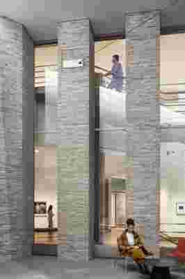
A view into the renovated galleries from the museum’s new atrium.
The original Moore-designed Hood Museum is a 1985 Flemish bond brick building that announced itself on the Dartmouth Green (the campus's student heart and central green space) via a gray brick Neoclassicist post-and-lintel archway within a structure that bridged the adjacent 1884 Wilson Hall and 1962 Hopkins Center for the Arts. Under the archway was an interior courtyard; beyond, visitors emerged onto a hardscape landing and could enter the museum up a curving set of stairs into a small vestibule.
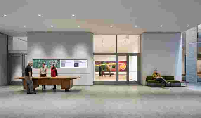
The Tsien-Williams renovation and expansion, which was revealed to a crowd of journalists and trustees on Friday, January 25th, and opened to the public the following day, removes the beacon archway and opens part of its internal courtyard to the air (an attempt to rid the previous space of its wind tunnel effect that is not wholly successful). The entrance orientation was flipped to face the Green in a new two-story gray brick building that leads the public first into an atrium that maintains the Moore link to the Hopkins Center (the Wilson connection was removed), then through glass doors to either the museum galleries or the new art study center—a set a three classrooms, an art holding room, and a massive art elevator that serves both the center and the museum. A 14-foot-square vitrine window at the new front gives a peek into the exhibits from the ground, and can be closed off to display light-sensitive works. Inside, curators are thrilled that there are now 16,350 square feet of exhibition space. Renovated Moore galleries are distinguished by their original wood baseboards, while expansive new Tsien-Williams spaces have metal ones.

Inside the museum’s new atrium, where partnered entrances to the center for object study and the galleries flank the expansive welcome desk.
The scheme met much controversy when it was first shown publicly three years ago. Preservationists, architects, and the head of the Charles Moore Foundation alike expressed opinions that it was not sensitive enough to Moore's original design. Tsien, instead, maintains that the new and old buildings are "in relationship."

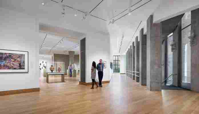
The first floor of the renovated museum, including installations of contemporary photography, global ancient art, and traditional African art. The restored Charles Moore–designed stair at the right leads to an auditorium.
"We are both honoring the Moore legacy and making new space," she said during a press tour. The Moore building wasn't perfect, and what Tsien and Williams have designed responds elegantly to its brief, a functional expansion that will support an arts institution that has grown rapidly in the past 30 years, and introduce the public to much more of its 65,000-work collection. Yet while pieces of the late architect are still alive in the project—his arched windows and bauble-like decorations atop pitched copper roofs, the angular face that was its former formal entrance, a semblance of the original archway passage—his public-facing architectural idiosyncrasies have been muted.
Forward-looking and contemporary, the museum and trustees received exactly what they wanted in the reinvented building. Summed director John Stomberg: "This is now the gateway to the arts at Dartmouth."


