May 06,2022
This Rental Shows How to Use DIY Color Blocking to Distinguish Areas in an Open Layout
by David Stewart

Name: Justine Villanueva , fiancé, Enrique, and 5-year-old miniature poodle, Oscar Location: Toronto, Ontario, Canada (Downtown Harbourfront) Type of home: Condominium Size: 785 square feet Years lived in: Less than a year, renting

Tell us a little (or a lot) about your home and the people who live there: Where to start… Well, Enrique, Oscar, and I moved into our rental home last year during the pandemic. It is a one-bedroom and one-bath unit with a den. What drew us to the unit the most was the 10’ ceiling height. It just made the place feel bigger than it really was. The unit faces east, which allows plenty of natural light to come in throughout the day, and it also has a lovely view of Lake Ontario from the balcony, which just made it all the more perfect for us. My fiancé and I both work from home, so the den was perfect for a shared office. As for our fur baby, Oscar, the place was the perfect size for him to be able to run around and play without bumping into walls or furniture.
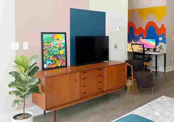
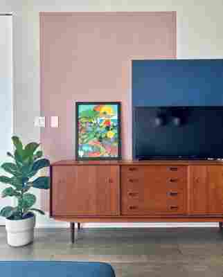
How do you identify? Is your identity reflected in your home? As renters, we wanted to make sure that we respected our landlord’s wishes while still making our rental suite feel like our home. We wanted to bring in as much personality as we could without having to rectify too much once we move out. With that idea in mind, I introduced pops of colour to our space by painting our walls. We chose our favourite colours such as mauve, navy blue, and hunter green to really create bright colours that complemented each other in an open layout.
I specifically wanted to do color blocking on our walls to create an imaginary border between the different areas of our space (ex. living area and dining area). As for our furniture, we are obsessed with vintage mid-century pieces and saved just to get them. We lived in our home for five months prior to getting a dining set just because we wanted vintage mid-century dining chairs and had to save to afford them. Lastly, for our accessories, we wanted to keep it very minimal so that our furniture pieces would be appreciated and be seen for themselves. We always followed the rule that interior design should first and foremost be functional and efficient.
Describe your home’s style in 5 words or less: Mid-century modern meets pop art
What is your favorite room and why? My favourite room — or area in this case — is the living area. It is my absolute favourite because I can see the view of the lake, my colourful walls, and my happy plants just by sitting on our sectional sofa. It’s such a lovely view, especially in the morning where it’s so bright and airy in our home.
What’s the last thing you bought (or found!) for your home? The last thing I bought for our home would be the paint that I used for our den/office. I recently learned that you could buy sample size paint cans (1 pint) for only CAD $10! Because I was painting a mural, it was just the size that I needed to avoid waste and unnecessary spending. I bought my paint from a local paint shop and chose the brand Benjamin Moore.
Any advice for creating a home you love? My advice would be do not be afraid! Whether you own your home or you’re renting, you can always find creative ways to make your place feel like an extension of yourself. You may have the same furniture as other homes, or have the same cookie cutter layout, but how you use and express yourself in your space will make your home one of a kind. Be bold, and find what works for you. Do not limit your creativity to what you find online — after all, it is you who will enjoy your space.
This submission’s responses were edited for length and clarity.
Share Your Style: House Tour & House Call Submission Form


