November 16,2022
The 7 Ugliest University Buildings in America
by David Stewart
While Collegiate Gothic architecture reigns supreme amongst university design favorites, some higher education institutions have decided to challenge the norm with a more modern approach. Sadly, these designs sometimes fail to reach that timeless standard and end up looking very out of place in the academic world. Here are eight examples of university buildings that didn’t quite make the grade.

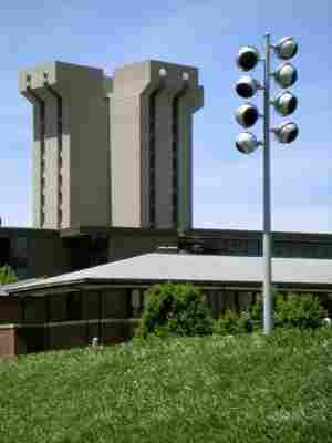
Crafted from a single pour of concrete, this 16-story building looks more like a Disney villain's lair than a part of the University of Cincinnati’s campus.

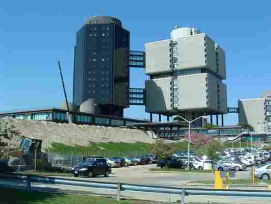
The black cylindrical glass building paired with a drab stone box looks as if the two were built as separate entities and connected by two throughways as an afterthought.

Though it was ranked among the top research libraries in the country in 2011, the library’s odd boxy exterior begs for a modern update.
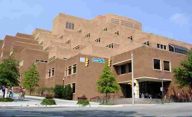
The microscopic windows dotting this boxlike structure give this educational hospital a prisonlike appearance.
Completed in the late 1980s, this shining example of late modernist architecture is reminiscent of another 1970s design: the Death Star.
While this building is one of the most environmentally conscious university buildings in use today, its checkerboard design and Tetris-esque exterior earns the John and Frances Angelos Law Center a prime spot on our list.
This university building may look like a futuristic version of the Roman Colosseum, but the only battles happening within these walls are with the bar exam.


