December 12,2022
Rooms of Their Own
by David Stewart

Scott Snyder
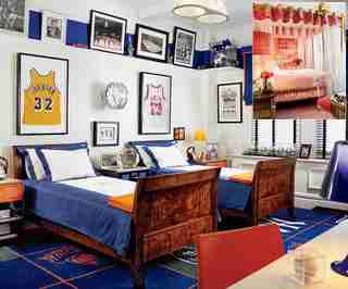
The rest of the apartment is timeless, but we thought it would be right to give the children something age-appropriate,” Scott Snyder says of the rooms he designed for three children in a Manhattan residence. Snyder and his associate Mark Kelly worked closely with the young clients. “We had a meeting where they brought us ideas of what they wanted,” Kelly recalls. For the then nine- and 11-year-old boys, who were to share a room, incorporating their collection of sports memorabilia dictated the overall look. The carpet, from Beauvais, bears the logos of New York teams, while the palette was drawn from the New York Knicks’ colors—even the Roman shade fabric, from J. H. Thorpe, is in the team’s signature blue.
The girl, then 13, “requested pinks and gold, with lots of shiny things, with a canopy bed,” explains Kelly. He and Snyder obliged, giving her plenty of pink furnishings, including the carpet, from Beauvais; mirrors, Lucite and a crystal valance trim, from Samuel & Sons, add sparkle to the space.

Ron Wilson
When he sets out to design a room for a child, Ron Wilson says, he begins with a few basic principles: “The materials have to be reasonably priced. Fabrics have to be washable. Carpets have to be cleanable.” Beyond that, Wilson, whose projects generally include at least one room for a child or teenager, gives his imagination free rein—within reason. “I’ll tell my clients, ‘Use wonderful things but things that you won’t mind giving away.’”
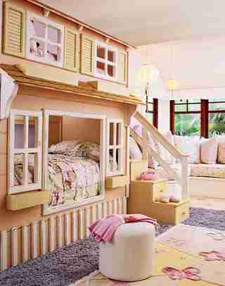
For a seven-year-old girl’s room in a Hawaii residence by the architectural firm Ike Kligerman Barkley (see Architectural Digest, August 2007 ), Wilson and his partner, Joe Guidera, created an airy hideaway anchored by a painted wood house that holds two beds, one for the girl and another, on top, for a visiting friend. It does double duty, since the stairs provide storage. (More storage is found beneath the banquette and in a small armoire.) Wilson balanced the heaviness of the bed with a light mix of patterns and pastel hues, which also “keep the room bright and youthful,” he points out.

Alexa Hampton
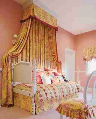
Although the furniture had already been chosen for a young girl’s room in a house on Long Island (see Architectural Digest, July 2007 ), Alexa Hampton still had to flesh out the space. The question, she remembers, was, “What could we do in one fell swoop to decorate the room?” Her solution was to add a half-canopy bed and balloon shades. Placed against a wall, the bed also functions as a sofa and “doesn’t intrude into the play space,” notes Hampton. The shades are similarly unobtrusive and, since they are well off the floor, are less likely to get dirty, always a paramount concern in a child’s room. The canopy, shade, chair and bed skirt, done in a fabric from Cowtan & Tout, with a trim from Samuel & Sons, provide spots of color, and the entire room is leavened with dashes of white. Finally, the room could grow with its occupant, given that the scheme could be altered, with a minimum of effort, to meet the girl’s changing needs and aesthetic.
The girl, like her parents, “has a fun sense of style,” says Hampton, and she was allowed to give her input on the project. Typically, however, Hampton asks her clients to serve a dual role—as client and designer. “I’ll show the parents some options. They’ll show the child their choices. It gives the child agency in the process but also means that the parents can live with it.”
Arthur Chabon
What distinguishes these rooms from other children’s rooms is that they’re in a vacation house,” Arthur Chabon says of a pair of rooms in an Aspen, Colorado, residence (see Architectural Digest , July 2004). So instead of planning spaces that could be frequently—and easily—changed, Chabon, who served as the project’s interior architect, and Buck Rodriguez, the interior designer, ensured that the rooms would be filled with familiar memories for the children, at the time ages six and eight, every time they visited the house.
The rooms have similar architectural features. Each has a dark-stained beam ceiling and wainscoting and a high shelf around the perimeter. The rooms share other features: Furniture placement is consistent, with wall lights and tables flanking the beds; Stark carpets in a neutral tone ground each room; wallpaper, draperies and bed linens offer splashes of color. And each has a collection of antique toys sourced by Rodriguez and the clients. “We wanted them to always remember the chandelier made from an airplane and the miniature chairs in the girl’s room. Those spaces will always be about those things,” says Chabon.
Mariette Himes Gomez
Situated on an upper floor of a Wyoming vacation house (see Architectural Digest, June 2007 ), overlooking a grove of aspens, the bedroom Mariette Himes Gomez designed for a family’s three boys, then in their early teens, “is like a tree house,” she says.
Though the rest of the residence is Gomez’s modern take on a ranch house, her clients requested a more traditional look for the boys’ room. The space, she says, “is my articulation of a classic bunkhouse, albeit in a house”—a space that could accommodate the growing boys and their guests. For the 18-by-20-foot room, she had two sets of four maple bunks built and placed the sets against opposite walls. She kept the rest of the furniture to a minimum: The desks are built in, and the bunks offer storage in the form of drawers and bookshelves.
Gomez’s concept of children’s rooms is elastic: She believes that the idea encompasses all of the rooms they inhabit. As she has in other houses, Gomez located a television and computers in a nearby family/media room, both to make the bunk room about sleep and to have a communal area where the family could gather.
The bunk room has turned out to be so popular that even adult guests ask to stay there. Perhaps more important, several years on, “the boys still use it!” marvels Gomez.
Irwin Weiner
The guest room in Irwin Weiner’s weekend house in Pennsylvania functions equally well for his young nieces and for his older visitors. Weiner “didn’t want the room to be too childish,” he says, but at the same time, he wanted the space to be comfortable. As he does when he creates rooms for his clients’ children, Weiner eschewed built-ins in favor of pieces that can be easily moved or changed and selected hypoallergenic materials like cotton (the Ralph Lauren Home bedding is made of that fiber) and cork. Though sophisticated, the space, he says, “is appropriate for kids.”
Peter Pennoyer
We encapsulated the furniture into one piece that could be modified over time,” architect Peter Pennoyer says of a room for a five-year-old boy in a Manhattan town house. The ingenious structure holds a bunk bed, shelves for books and toys and an adjustable-height desk. Pennoyer “wanted the piece to be as comfortable as possible,” so there are no sharp edges anywhere on it. Victoria Hagan, the project’s interior designer, also emphasized comfort, giving the room a plush carpet and an abundance of soft places to relax.
Campion Platt
For his son’s room in his Manhattan apartment (see Architectural Digest, September 2007 ), Campion Platt aimed for a space that was “elegant, fun and educationally inspiring,” he explains. Designing most of the furniture himself and using a dark, rich palette of earth tones—including the Jim Thompson bed silks and Patterson, Flynn & Martin carpet—Platt set the stage for quiet study and relaxation. The shades the architect chose, he says, “also enhanced the monochromatic nature of the black chalk teaching globe and the art,” a series of 1920s images by El Lissitzky.
1100: Architect
Juergen Riehm’s goal for a boy’s bedroom in a Brooklyn town house (see Architectural Digest, October 2007 ) “was to make a stimulating environment that expressed his personality,” says the architect. For his firm, 1100: Architect, it meant incorporating the young resident’s favorite color, green, and his interest in science and geography. The architect and his team “played with several different shades” before settling on the perfect hue, picked because it blended well with the colors in the map that covers the wall behind the bed. Of the map, he reports, “We treated it as wallpaper; it has a panoramic effect and breaks up the room.”


