August 01,2022
Color, Energy, and Contemporary Art Impart a Sense of Wow in This Soho Apartment
by David Stewart
It’s rare to find an apartment in which a powder-blue quilted Moroso sectional, a red spiked Marzio Cecchi–inspired bean bag chair, Osborne & Little’s Flamingo Club wallpaper, and sleek Roll & Hill and Apparatus light fixtures live in harmony. It’s even more rare when such a colorful, curated assemblage belongs to a straight-laced bachelor in the finance industry. Enter Elena Frampton of Frampton Co’s client’s three-bedroom apartment in downtown Manhattan. “His attitude was, ’Bring it On!’” says the New York designer of her rarefied client, with whom she had worked previously on his former pad in Tribeca. Though his job is decidedly black and white, his interests lie in fashion and design, says Frampton: “I can speak freely about what I think the experience should be and he’s on board with that. The approval process was very smooth.”
Notably, this particular project is located inside trendy 10 Bond Street. The Annabelle Selldorf–designed building has a distinctive façade with oversize window and terra-cotta panels, yet the interior of the unit was essentially a white box, Frampton recalled. “There was a lot of work to be done to better marry the inside and outside,” she says. The designer’s goal was to create livable, comfortable interior spaces that at once suited the home’s remarkable exterior and her client’s high-pressure lifestyle, all while incorporating the bold design elements that were important to the homeowner—namely, contemporary art, much of which was selected with the help of Manhattan advisor Elizabeth Margulies.
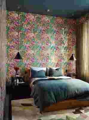
In the guest bedroom, Osborne & Little’s Flamingo Club wallpaper acts as an exotic backdrop for a Roll & Hill fixture and vintage Albert Joseph nightstands.
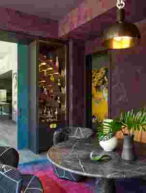
Frampton got started in the extra-large living room, crafting several seating arrangements and layering in color-drenched rugs, vintage furniture silhouettes, and impressive art installations. The white space of the ceiling stuck out like a sore thumb against the wall-to-wall windows, so the designer toned down the color and made it high gloss. Though not one for formal dining, her client loves to entertain and does so often. A third bedroom was transformed into a sexy lounge space with a low-slung game table for take-out meals and evening cocktails. (Construction was overseen by Best & Company.) So as not to abandon all bachelor pad conventions, nearby there’s a glass Ping-Pong table from Impatia. “We had a clear vision,” the homeowner says. “I wanted to make a statement.”
While the public spaces are decidedly loud, the master bedroom is subdued, with a large silk rug, an upholstered bed, low-wattage light fixtures, and a palette of beiges and soft blues. “When you close that door, you are sealed up in a cocoon,” says Frampton . And though the bedroom walls are upholstered in a neutral-toned wool, true to form, the designer lined the seams in a metallic leather. “Just a reminder that you’re still in the same apartment!” she says.
RELATED: An Architect’s NYC Bachelor Pad with Art Gallery Appeal

