September 01,2022
Charles and Ray Eames' Neutra Apartment
by David Stewart
View Slideshow

We live in one of the newest houses in California," wrote Ray Eames almost fifty years ago, describing the apartment in west Los Angeles that Richard Neutra designed in 1937. She and Charles Eames resided there for most of the 1940s. They had met at the Cranbrook Academy of Art in Michigan, were married in 1941 and drove to Los Angeles to launch one of the most inventive design practices of the century.
For the Eameses, the airy hilltop apartment was a workshop/laboratory as well as a retreat, "offering moments of calm and rest and pleasure at the beginning and end of each day," as Ray wrote. Neutra had provided "a beautifully clean and simple shell [that] imposes no style on the tenants, but leaves them free to create their own surroundings through color, texture, use of area and equipment needed for everyday life and activities." In 1949 the Eameses moved on to the steel and glass house they designed for themselves in Pacific Palisades, taking with them an idiosyncratic array of objects they had acquired or made and leaving a blank canvas for future occupants.
That's what I liked most when I came here 19 years ago, camping out in the luminous white space and assuming that I, too, would soon move on. The abundance of light and good proportions were enough in themselves—a blessed release from the claustrophobia of an old, dark house in Washington, D.C. The 1994 earthquake spared the apartment and spurred me to celebrate the different traditions of modernism it stands for.
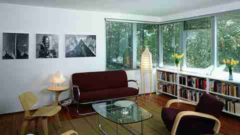
Over the past three years, with the encouragement and advice of Cheryl Brantner and other interior designers, I've redecorated the apartment as a tribute to Neutra and the Eameses. The goal was to foster a dialogue—enriched by personal memories and enthusiasms—between those giants, weaving together metal and wood, angles and curves, plain and colored surfaces, and finding the connections between them. White stucco walls, ribbon windows with silver trim and a wood strip floor provide the frame, dense foliage the backdrop.
Neutra likened his houses to machines in a garden: cutaway boxes with transparent façades and projecting planes that reached out to embrace the landscape. The Eameses loved what machines could do for them, but in the first years of their practice, they molded wood with their hearts and hands as generations of artisans had done before them. That fusion of craft and mechanization provided a cue for the furnishings: a curvilinear steel framed sofa that Gilbert Rohde designed in the same year as the apartment, tautly curved birchwood armchairs that Alvar Aalto fashioned a few years before, and the molded plywood (LCW) chair that launched the Eameses' reputation in 1946. These classics are set off by two other Eames pieces: the molded plywood leg splint that was stamped out in huge numbers as their chief contribution to the war effort, and the folding screen of 1946 that resembles a rippling curtain. Each of these pieces was originally a daring new venture, and each exploits technology to achieve a growing subtlety and complexity of form.
The splint and LCW chairs were conceived in this apartment and mocked up with the aid of the "Kazam!" That was Charles's affectionate name for a homemade press he built and installed in the spare bedroom to create compound curves in hand glued plies an achievement that had eluded other designers. Early on, prototypes were shaped to the Eameses' bodies—which helps explain their mix of grace and comfort—before being fabricated on industrial presses. Their shapes and the folds of the screen are echoed in a cluster of Finnish glass vases by Aalto, Kaj Franck and Timo Sarpaneva.
At the opposite pole are mementos of the machine age: 1930s posters for streamlined automobiles and ocean liners, a sketch for the mile high city of Fritz Lang's science fiction epic Metropolis and a recent aluminum sculpture by Carlo Borer, a Swiss artist who is inspired by airships. These generate forms that are repeated around the room—in pyramidal lamps by Isamu Noguchi and Joseph Shuldiner, a vintage light shade and bowl of spun aluminum and Eileen Gray's chrome and glass side table, which embraces an Aalto stool, the circular tops overlapping to suggest an eclipse. Sallie Trout, a young southern California designer, created an aluminum cabinet for tapes and cassettes that she enhanced with sanded swirls and whimsical drawer pulls.
The dining area complements the orthogonal room. I replaced the rectangular top of Le Corbusier's airplane table, with its base of ovoid metal tubes, substituting a truncated oval of glass that plays off the sensuous curves of Philippe Starck's Louis 20th chairs. A smaller version of the same bowed top is employed for a low table with a brushed chrome skid base. Streamlined kettles, models of prewar automobiles and the Eameses' House of Cards are lined up as a decorative frieze beneath the window.
The apartment has always had venetian blinds—at least since 1938, when Julius Shulman photographed Neutra visiting Luise Rainer, the first occupant—and they filter the sun that penetrates the room early and late, glinting off polished surfaces and creating a play of shadows and reflections. Black bookshelves on one side of the room contrast with white units on the other. Between them is a grid patterned rug that pulls the disparate elements together and subtly echoes the green of foliage and the purplish reds of upholstery and dining chairs. Nolli's map of Rome offers another kind of geometry: a dense checkerboard of solids and voids that charts routes through the old city. Black and white photographs by Henri Cartier Bresson and Willy Ronis recall fond memories of Parisian street life.
Neutra had little feeling for color, but he tiled one of the baths in iridescent blue, and that provided an excuse to abandon tonal restraint for a moment. His contemporaries in Weimar Germany and the Netherlands used bold colors to articulate the planes of their buildings, so I had the walls and ceilings of my bedroom painted in the de Stijl palette of primary red, blue and yellow, which is set off by the anthracite carpet, silver gray blinds and white walls beyond. A blue chest, a red covered sofa, a Navajo rug and a Mackintosh chair seem to vibrate within this intense color field.
To complement the blue bathroom tiles, I've added a sauna stool with a tilted horseshoe seat and four splayed legs. Inspired by peasant craftsmanship, this supremely practical, rough textured object was created in 1951 by Antti Nurmesniemi, one of the great Finnish designers. In the office next door, a sixteen foot run of polished ash plywood occupies the site of the Kazam!, creating a work surface that accommodates several projects at once and still leaves room for a fledgling collection of turned wood bowls. Sculptural, modern chairs play off the sisal carpet and expansive shelving; a sea fan wraps around the functional ceiling light in a reference to the Eameses' love of tumbleweeds, which they brought home from the desert and suspended like mobiles. Japanese prints and naive paintings from Brazil animate this tranquil room.
The black and white kitchen once overlooked the ocean. Later buildings have blocked the view, and so, to dissolve this unwanted foreground, I've installed squared translucent glass that evokes the wall of glass blocks in Pierre Chareau's Maison de Verre. And, to incorporate another well loved feature of Paris, the terrace is furnished with traditional French park chairs. Sitting there, among the treetops, I reflect on how Neutra's machine has been swallowed up by its garden, and how the house that was new when the Eameses moved in has become one of Los Angeles's more recent Historic Cultural Monuments. What hasn't changed in sixty years is what matters most: the harmony of scale and proportion and the sense of openness to nature and to the cooling ocean breezes that still flow through at sundown.


