February 09,2022
Apple Music Apple Music review - now available on Android
by David Stewart
After all the fanfare and controversy, Apple Music has now been with us for three months, which is an important milestone and one that Apple will be keeping a keen eye on. Why is that, you ask? Because Apple Music was available as a free three-month trial to all Apple ID account holders and now those trial subscribers need to make the important decision as to whether to part with hard cash for Apple’s streaming service. You don't need a brand new iPhone 6s to try it out, either - any iPhone or iPad running the latest version of iOS will be able to access it. This review will focus on the paid-for aspect of Apple Music as the free option basically relegates you to listening to radio stations with limited skipping.
Apple Music Setup
The first step in your voyage of music discovery (also known as ‘signing up’) is letting Apple Music know what your musical tastes are. This takes the form of selecting coloured bubbles, first to indicate what genres you like, then on to selecting individual artists.
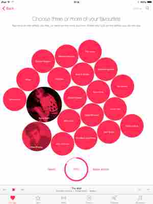
You can tap each bubble up to twice to indicate a very strong preference, or tap and hold to indicate you’d rather cut your ears off than listen to The Spice Girls. On the artist selecting screen you can hit the ‘More artists’ button to bring in more bubbles to more suitably fine-tune your tastes and the whole process is nicely animated. It’s a pretty intuitive way to get going but the strength of Apple Music is in how it learns based on your listening history. Once you’re all set up you’re released into Apple Music’s main interface.
Interface
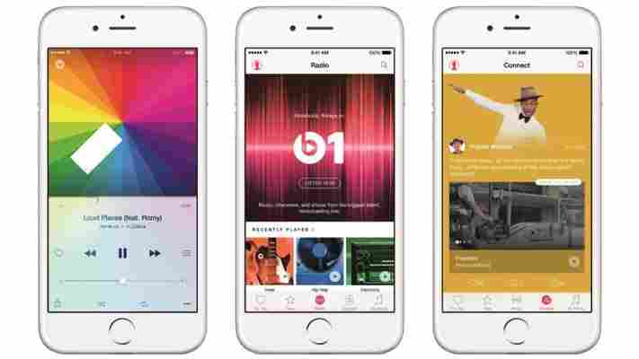
The general UI is essentially broken down to six tabs along the bottom with a pervasive search option available in the top right corner to make it easy to quickly find artists or tracks wherever you are. The bottom tabs are For You, New, Radio, Connect, Playlists and My Music.
One thing is immediately obvious with Apple Music’s interface and that is that white is favoured heavily throughout. This is in stark contrast to Apple Music’s biggest rival, Spotify, which favours a green and white on black colour scheme, as well as other services such as Deezer that also use a more high contrast approach.
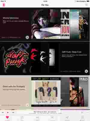
Apple’s pink and black on white certainly looks clean and, subjectively, attractive, but it’s also much harder to read than the high contrast Spotify interface. This is especially the case in outdoor sunlight. The Apple Music app certainly lends itself better to the smaller iPhone display than that of an iPad.
There are other nice design flourishes, such as the background colour changing on artist or album pages to generally match the cover art and you get a nice biography of the artist. The Now Playing screen similarly changes its colour to match the cover art.
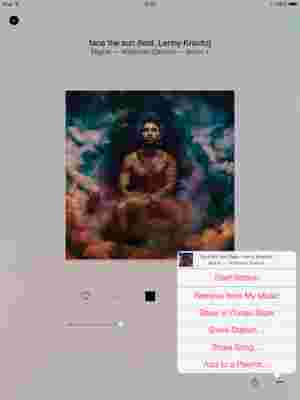
But then other elements of the interface grate. Some of the icons are tiny, especially on iPad, meaning you’ll often hit pause instead of hitting the ‘For You’ tab. Apple Music also runs poorly on older hardware. It’s slow and laggy on a second generation iPad, for example. A simple music app shouldn’t be laggy even on old hardware. There’s also a lack of cohesion between different areas of the app, with some appearing extremely cluttered and others threadbare.
For You (and Music Discovery)
In the For You tab, Apple will give you musical recommendations, be they artists, albums or playlists, based on the choices you made during setup, as well as your listening history. I indicated a strong preference towards hip hop, so often get playlists based around a theme of ‘Behind the Boards’, which gives you playlists based on popular producers.
Prior to launch Apple made bold claims about how its music curation was handled by real humans and not computerised algorithms. You get an indication of this by playlists created by different Apple Music genre specialists. ‘Apple Music Hip-Hop’ often makes an appearance for me. You get some interesting niche playlists, too, such as ‘Kanye West: Songs About Women’, showing that there is a personal touch and you also get nice descriptions as well.
Over time I did see the recommendations improve but it does still feel rather limited and certainly no better than Spotify, although the latter has the advantage of considerably more time to learn my listening history. Still, the human curated playlists don’t seem as big a coup as I would have thought. You still get mainstream recommendations and the same old popular tracks showing up across different playlists.
New
The New section is pretty self-explanatory. Here you’ll find new albums and playlists and is an easy way to stay on top of new releases. At the top of the screen you can filter by different genres, which is good if you want to delve into a genre you might not have indicated a strong preference for during setup.
The focus of new content is very mainstream-focused. If you have more niche tastes, you might not find the recommendations tie in with your preference for Inuit eskimo music composed on the carcasses of dead yaks. I find the presentation a little messy, too. There are horizontal carousels, nested lists and grids all merged into one long vertical list.

