November 10,2022
A Glass-Walled Aerie Marked by Minimalism and Contrast
by David Stewart
David Mann, the founding partner of MR Architecture + Decor, lived in a Greenwich Village studio for 35 years. It was a distinctive prewar penthouse with an impressively large corner terrace where the architect hosted countless summer parties, yet it had only 400 square feet of living space. After Mann’s longtime partner, Fritz Karch, moved in, the apartment’s limitations began to outweigh its charms. “We decided we needed a little bit more space, so we moved uptown to an adult apartment,” says Mann, half-jokingly, referring to the couple’s 1,800-square-foot, 19th-floor residence at United Nations Plaza, a set of modernist glass-walled towers designed by Wallace Harrison and Max Abramovitz in 1966.
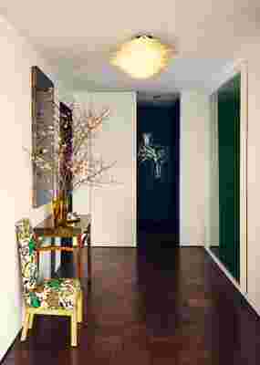
In addition to comfortable proportions, the property has a sensible layout, with two bedrooms on opposite ends of the space, two bathrooms, a foyer, a kitchen with a breakfast nook, and a grand living and dining area. Mann, whose firm has an eclectic portfolio that includes everything from construction to decoration, gravitates toward minimalism when it comes to his personal style. He’s also drawn to the color black (it’s rare to see him wear anything but black Prada suits), which is seen in many of the apartment’s walls, as well as in carpets and other surfaces. There’s plenty of white as well. “One of the things I like about black walls is that they recede at night, which is when I use the apartment the most,” he says. “And white reflects light.”

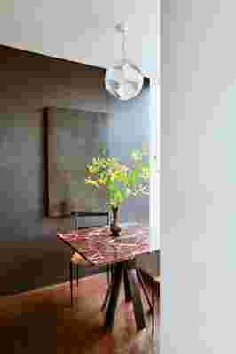
In the breakfast nook, Mann placed an intriguing self-portrait by contemporary artist Benjamin Cottam, which was glazed over in black. “I think the work is about looking more intensely,” says Mann. “I have to tell people to look for the face.” The light pendant above the marble-topped table (with an Angelo Mangiarotti base) has an optical trick as well: Look through the pentagram-shaped acrylic lenses, and everything appears magnified.
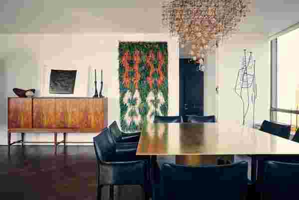
As for choosing the furniture, he approached the task as if he were compiling the guest list to one of his parties. In other words, he assembled a collection of wildly diverse objects that he really loves. “I think the disparity holds together because everything had a special allure for me,” he says. “I didn’t really have a specific look in mind.” The dining area, for example, is anchored by a chandelier made of bronze electrical circuits connected to real dandelion seeds. To go underneath this light installation, Mann commissioned a solid-brass table, pairing it with slim black leather armchairs by Mario Bellini. On the opposite side of the room, the sitting area features a set of Finn Juhl bench sofas with very simple lines, and two dark stone sculptures used as coffee tables.
While the apartment clearly reflects the architect’s minimalist sensibilities, it also shows off his partner’s taste. Karch—an author, stylist, and former magazine editor—is an avid collector of vintage curiosities, things like ceramic owls, tiny clocks, or old motel room keys. Many of these are on display in one corner of the master bedroom, as well as a section of the library. “He would pack everything full of stuff; that’s a big difference between us,” says Mann, adding that he nevertheless often collaborates with Karch on interior decoration projects. They do, however, have separate weekend homes.


RELATED: A Creative Guru’s Loft Where Conventional Design Rules Are Meant to Be Broken


